‘Full Circle’ opens Jan. 22, 2026 and runs until February 28 at Galerie Hans Brumann, Legaspi Park View Condominium corner Legazpi and Palanca Streets, Makati.
At Full Circle, jeweler and artist Hans Brumann returns to his namesake gallery with friends sculptor Impy Pilapil and painter-turned-product designer Tony Gonzales, in an exhibit of watercolors, sculptures, and paintings that all begin with the same question: What does it mean to really see?
Brumann presents watercolor studies made in Switzerland and France around the turn of the millennium, works that reveal how deeply his eye was shaped long before he ever picked up a brush.
To understand why Brumann, now 84, finds beauty in what others might dismiss as awkward or incidental such as a stray gutter, a rusty barrel, or a vertical drainage pipe of an old house, it helps to look at his life as a master jeweler. Jewelry trained him to think in structure and proportion, to notice how a single line can hold a form together, how light animates a surface, how balance is achieved through restraint rather than excess. These lessons migrated from metal to paper in this exhibit.
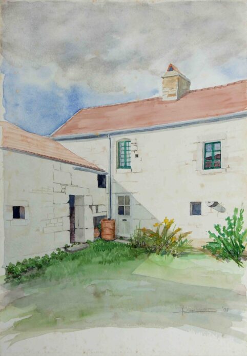
In Burgundy I (1998), Brumann turns away from any postcard idea of France. There are no vineyards or countrysides. Instead, he paints the back of a farmhouse, a working space usually hidden from view. What draws him is not charm but geometry, rhythm, and the straightforward truth of a place that has been lived in. The composition is built from simple elements: white walls, a red roof, windows, a narrow strip of sky. Yet the painting feels anything but simple.
Brumann has often described jewelry as “miniature architecture,” and sculpture as “jewelry for a space.” That mindset is visible here. The drainage pipe running down the wall is not an afterthought; it is the painting’s backbone. As a strong vertical line, it interrupts the horizontal calm of the building and anchors the entire composition. Nearby, a copper-colored barrel introduces a warm note, its rusty hue echoing the roof tiles above. The ground and the sky speak to each other through color. Nothing is decorative for its sake, like his jewelry. Every element earns its place through balance.
This sensitivity to structure shows up in Brumann’s fondness for linear geometry, just like in his jewelry. In Burgundy I, windows, doors, and even shadows become rectangles and triangles, arranged with the precision of a jeweler setting stones. The slightly awkward angles of the rear buildings are not corrected or softened. Instead, they provide perspective, more engaging to Brumann than a neat, symmetrical façade.
His attraction to the ordinary runs through the rest of the work on view. Brumann has said inspiration comes from all things around you, if you have the eye to see it. Rough wood, aging metal, unpolished corners carry their own honesty. There is also intimacy in the back of a house, far from the curated front. By painting gutters, weeds, and utility spaces, he captures something authentic about the countryside of Burgundy: not an idealized rural life, but one shaped by use and time.
Light plays a central role. In Burgundy I, a sharp triangular shadow cuts across a plain wall, an accidental shape cast by the sun. Brumann uses it to create depth and movement, turning an otherwise flat surface into something dynamic.
‘Carona’ by Hans Brumann
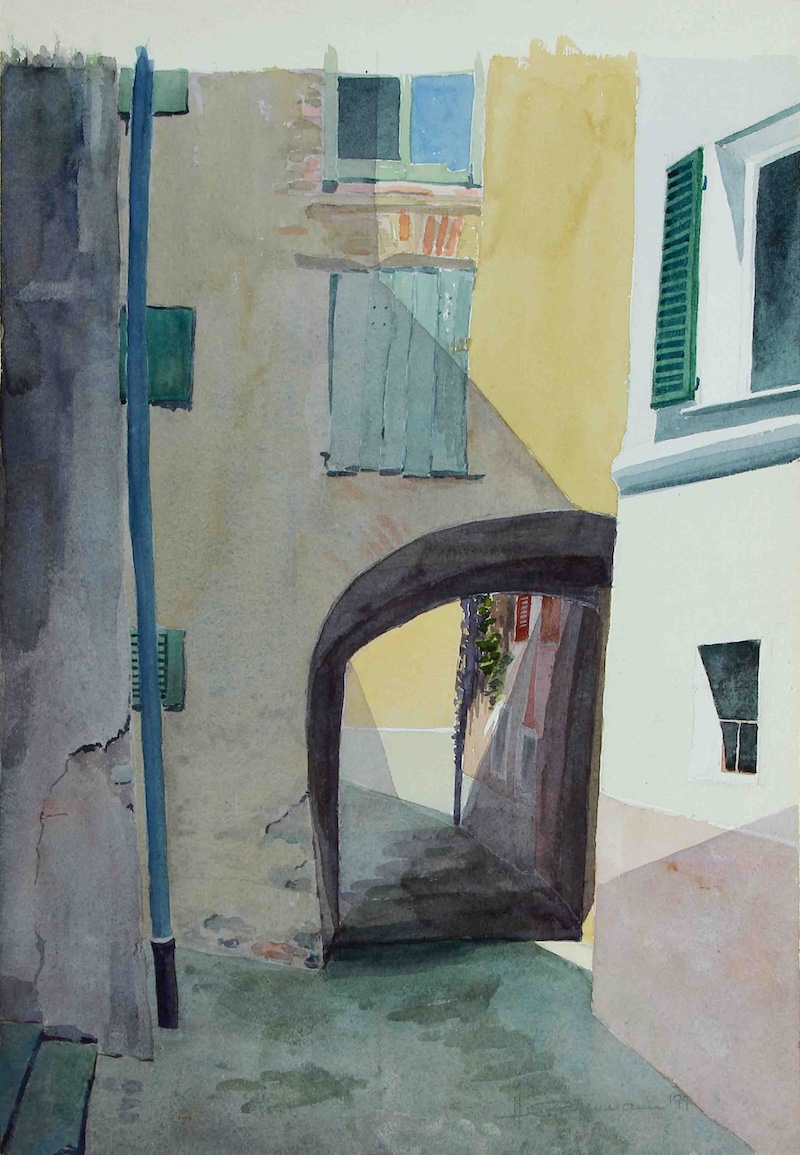
The Swiss watercolors of picturesque homes in Souzza and Carona, made around the same period, extend this attentiveness to place. Carona depicts a narrow passageway, architecture becomes a study in recession and light. Muted façades in ochre, gray, and pale stone are interrupted by shutters in subdued greens and blues. An arched opening pulls the eye inward. Brumann’s handling of watercolor is economical: washes are thin, edges often allowed to soften or dissolve. Instead of describing surfaces in detail, he lets light carve the space. He said the scenes were observed rather than staged, as if recorded during a pause.
‘Hoher Kaster’ by Hans Brumann
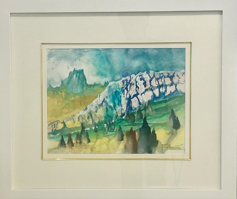
Brumann shifts from architectural intimacy to the alpine landscapes of the Alpstein mountains, yet the restraint remains. In Hoher Caster, a ridge of pale rock cuts diagonally across one composition, its form suggested through layered washes rather than line. Greens and blues bleed into one another, creating distance and height without sharp boundaries. Darker vertical shapes suggestive of trees or slopes anchor the foreground, while the sky stays light and unsettled, unevenly absorbed by the paper. The emphasis is not on grandeur but on weather, elevation, and passing conditions.
‘Säntis Mountain’ by Hans Brumann
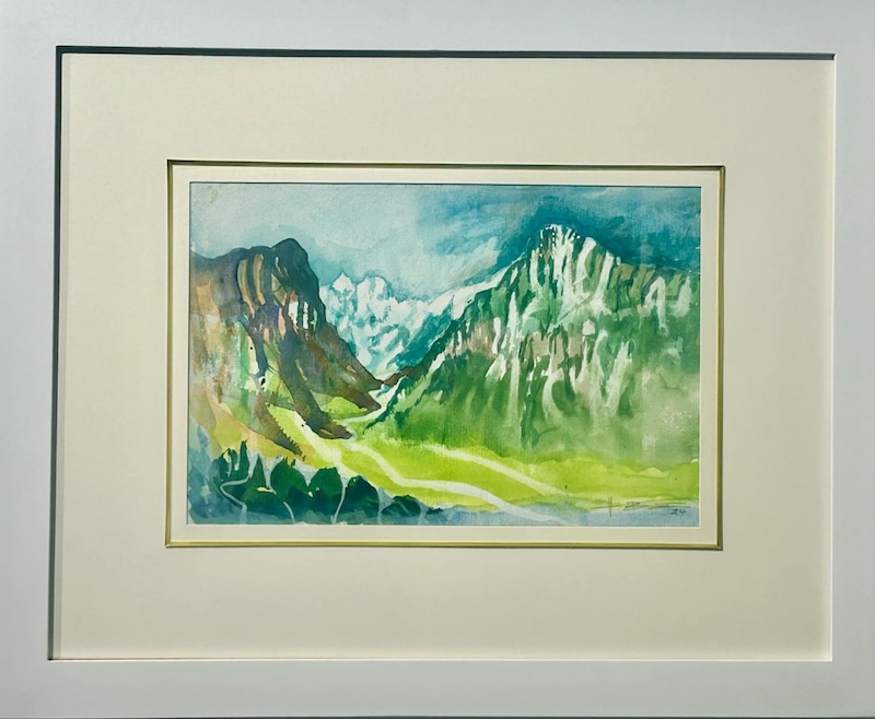
Another alpine scene, Säntis Mountain shows a valley framed by steep opposing slopes. Here the brushwork grows slightly more assertive, with vertical strokes hinting at rock faces and vegetation. The greens are vivid but tempered by translucence, allowing the paper to breathe through the image. A stream winds through the lower portion of the composition, gently guiding the eye inward.
Seen together, these works reveal a consistent way of looking. Brumann’s watercolors are less about subject matter than about balance, structure, and attention. Whether he is painting the back of a farmhouse or the slopes of a mountain, he sees the world through the lens of a craftsman—one who respects how things are built, how they age, and how beauty often lives in the parts that were never meant to be seen.
Impy Pilapil’s ‘Astra Gratia’
The sculpture of Impy Pilapil suggests that beauty comes from the soul, not from something imposed from the outside. That idea runs through her work, where movement is implied rather than shown, and heavy materials such as stone and steel often look light, as if they’re floating.
‘Surge’ by Impy Pilapil
Pilapil continues her decades-long practice of listening to stone. She treats raw, weathered materials not as inert bases, but as carriers of memory, as if the stones hold ancient knowledge
Pilapil often speaks of water and stone not as opposites, but as partners. In her imagination, water doesn’t just fall from cliffs; it rises, curves, and spills over rocks in a steady, flowing motion. Waves arc like silver ribbons, and foam traces looping paths that echo the paths of stars overhead. For a moment, droplets hang in the air, catching light like tiny constellations before falling back into the sea.
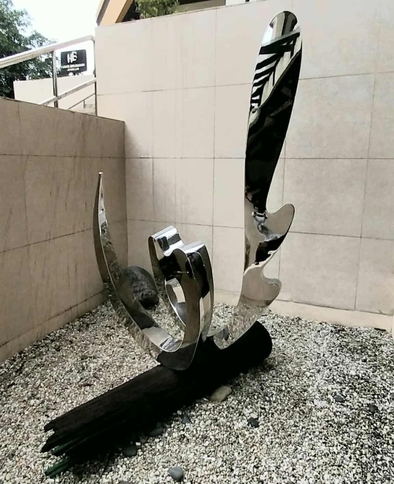
‘The Liquid Mirror: Wave V’ by Impy Pilapil
In The Liquid Mirror: Wave V (2002), Pilapil uses stainless steel, rigid and industrial, and shapes it into a form that mimics sea spray. The sculpture doesn’t just represent water; it behaves like it. A shiny wave rises from what looks like a charred log, its darkened wood reminding us of its history, as if movement comes from time itself.
The finish is what brings Wave V to life. The steel is polished to a mirror sheen that reflects its surroundings, including the people standing nearby. As viewers move, their reflections bend and shift across the curved surface, making the sculpture feel like an event unfolding in real time. You see yourself briefly, then lose yourself again in the curve.
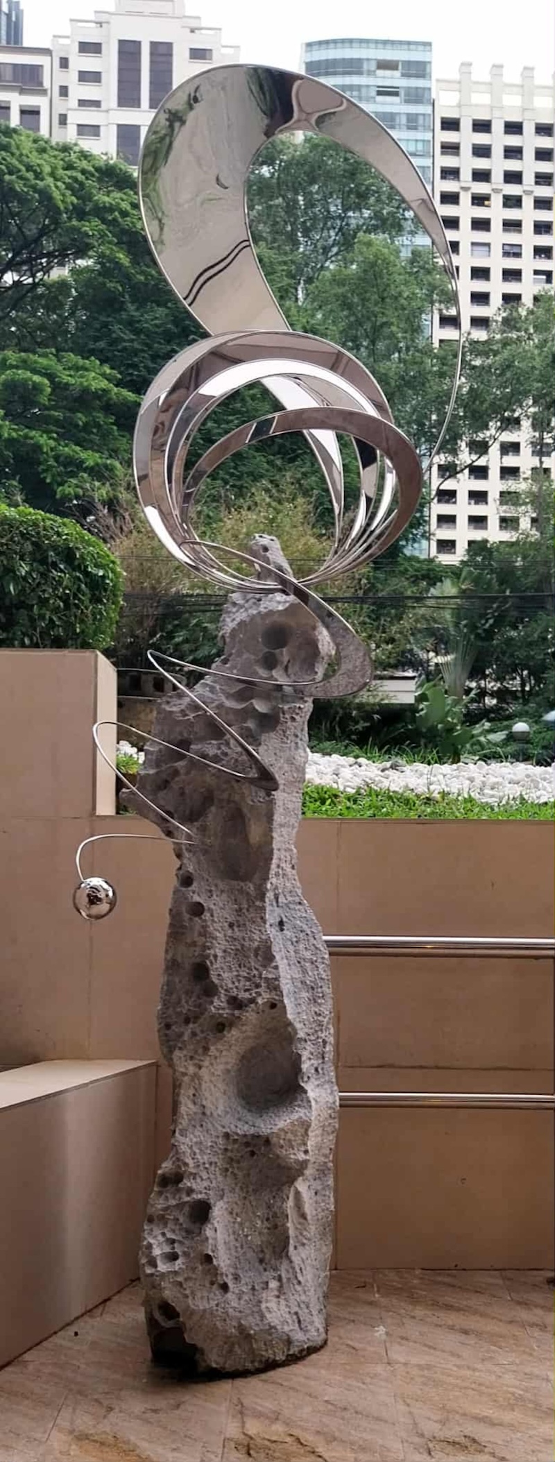
Surge (2008) takes the conversation further, moving from horizontal rhythm to vertical ascent. A tall, porous stone monolith, cratered like lunar rock, anchors the piece. From it rises a thin stainless-steel wire, spiraling upward in a controlled vortex. At the top hangs a small polished sphere, like a stray planet or a drop of mercury caught mid-flight. Where Wave V feels tidal, Surge seems airborne.
The sculpture has a faintly archaeological feel, as if it were a future relic found on an ancient site. The stone looks primordial, the metal precise and engineered. Still, the overall effect isn’t cold. That small tethered orb adds a playful note, keeping the work from feeling too monumental or serious.
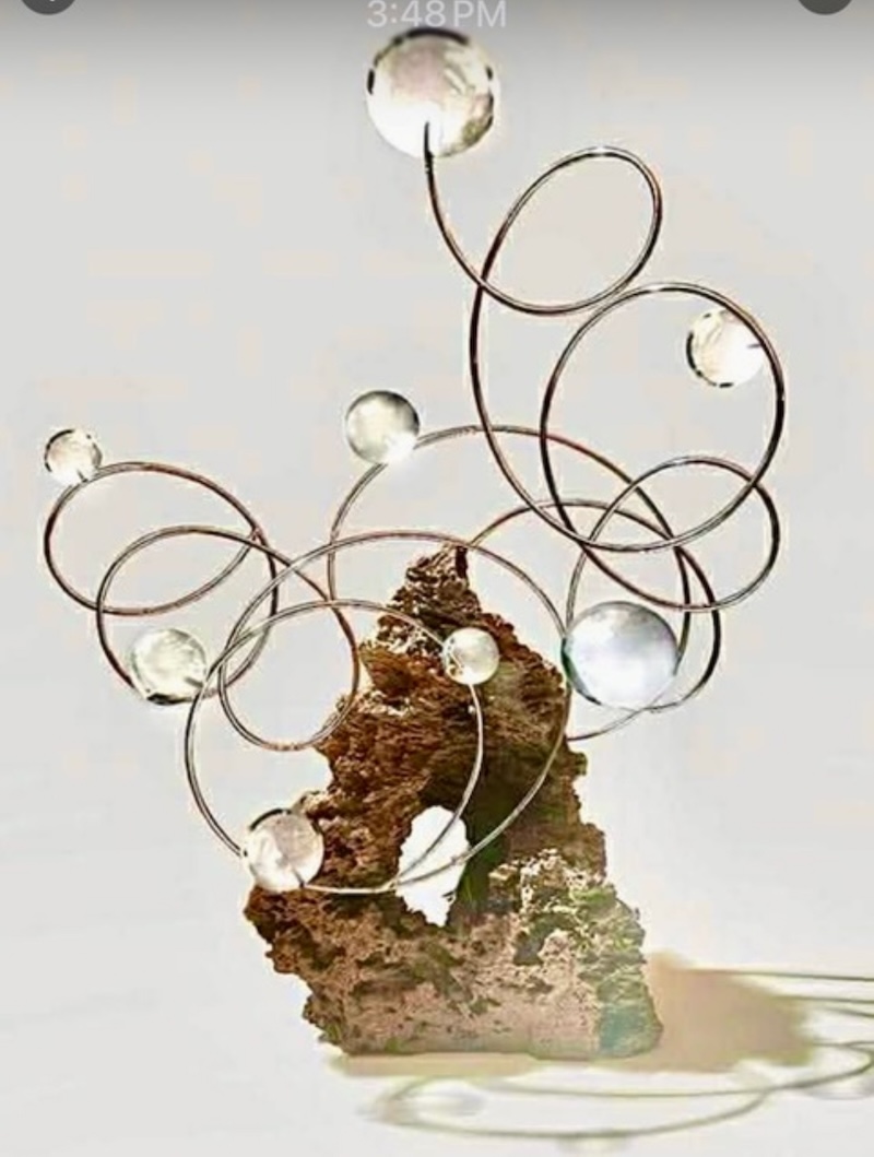
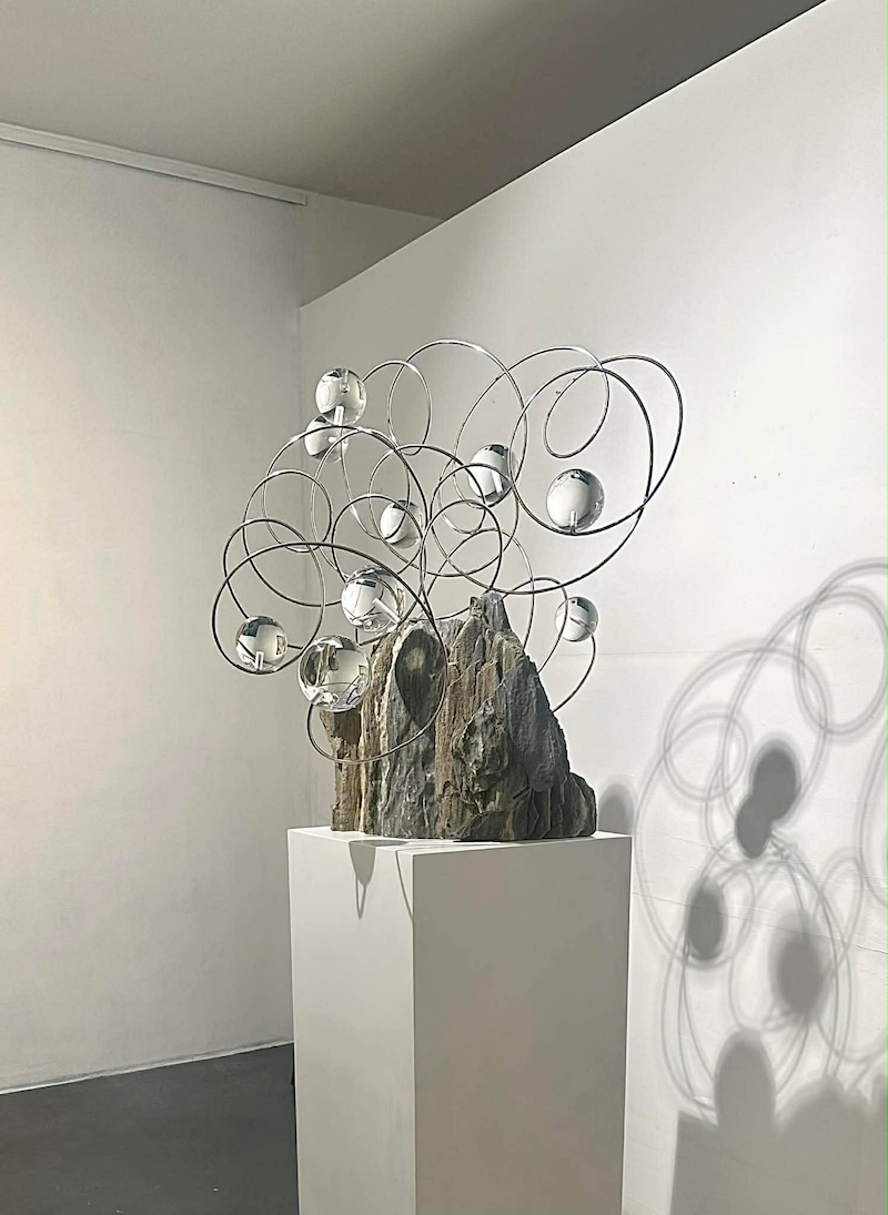
‘Astra Gratia’ series by Impy Pilapil
The Astra Gratia collection is named after a simple idea: graceful stars, turning and glowing in an endless dance. In one piece, she balances the rugged, volcanic texture of a monolith with a delicate, spiraling vortex of stainless steel. The spiral ends in her signature glass spheres, which looks like drops of celestial dew.
In the second work, the same tension appears in a different form. Graceful, lyrical wires rise from a heavy marble foundation, suggesting a surge of energy moving upward. By combining industrial metal with the character of Romblon marble, Pilapil creates a landscape that feels both intellectual and calm. The reflective surfaces pull viewers into the work, making them part of the experience. These are not just shapes on exhibit. They are openings that invite you to step out of daily life and into a larger, more cosmic conversation.
If Pilapil’s sculptures invite you into a cosmic conversation, Tony Gonzales brings you back down to earth—into memory, weather, and the slow accumulation of experience.
‘Untitled’ by Tony Gonzales
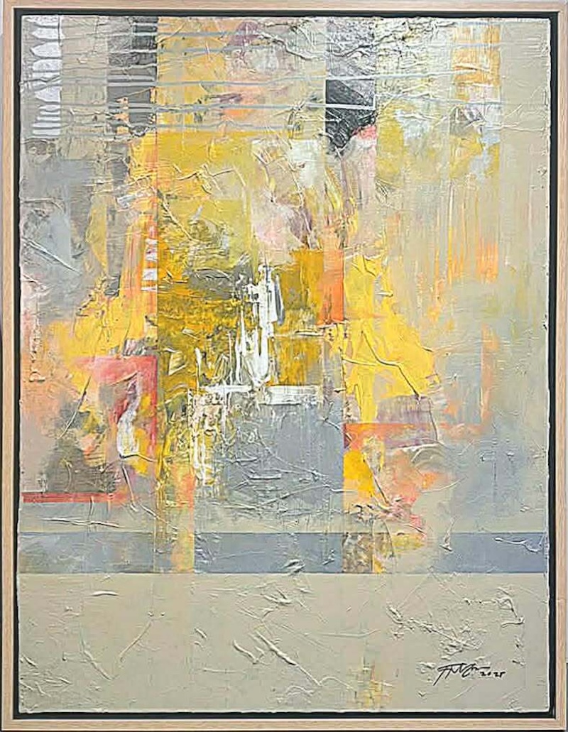
An abstractionist, Gonzales approaches the canvas without a fixed plan. He treats it as a meditative space. Color is thrown, smeared, and mixed instinctively, letting the subconscious take over. Years of travel, museum visits, and personal emotion surface. The brushwork is gestural and urgent, sometimes bordering on unruly. Gonzales calls this process patong-patong, or layer upon layer, where images and memories pile up, overlap, and jostle for space. All his paintings for the show are untitled, by the way.
Abstract expressionism by Tony Gonzales
At first glance, the surfaces can feel chaotic and heavily worked, thick with paint and time. But Gonzales knows when to stop. He brings the energy under control by adding disciplined lines or solid blocks of color, often squares or rigid forms. These shapes act like windows in the painting, moments of clarity amid the blur. They hold the work together without erasing its emotional charge.
One critic observed that Gonzales seems to tell a series of stories on the canvas and then partially erase them. He covers things up, but never completely. The earlier gestures remain visible, like faint memories refusing to disappear. That tension between revealing and concealing, between wanting to speak and choosing silence, is what gives the work its physical depth.
Standing in front of Gonzales’ paintings feels a bit like looking at a city through a rain-streaked window. You sense something solid beneath the surface such as a wall, a frame, a street corner, but it is softened by layers of atmosphere and time. There is order somewhere in there, but it is constantly being disrupted.
Abstraction by Tony Gonzales
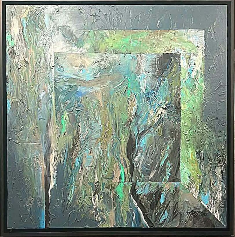
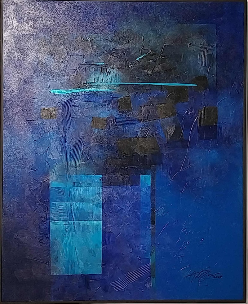
He says his work thrives on that push and pull between structure and mess. You can trace straight lines that suggest an underlying grid, only to see them smeared over with thick, heavy paint. In one large blue piece, color shifts from deep midnight tones to electric teals, evoking deep water or a night sky. The mood is introspective, yet the scratched and scraped surface gives it a gritty, physical presence, as if the painting has lived a hard life.
In other works dominated by greens and grays, the feeling turns more organic. These pieces resemble old stone walls slowly overtaken by moss and lichen. Gonzales doesn’t simply apply paint; he builds it into a crust, layering until the surface becomes almost sculptural.
Seen together in Full Circle, Gonzales’ paintings complete the conversation. Where Brumann finds order in overlooked structures, and Pilapil traces grace between earth and stars, Gonzales reminds us that everything in between is in flux. His work says there is beauty not just in what stands firm, but in what erodes, accumulates, and transforms. Together, they suggest returning to fundamentals of line, balance, material and movement.
‘Full Circle’ opens on Jan. 22 and runs until February 28 at Galerie Hans Brumann, lower ground floor, Legaspi Park View Condominium corner Legazpi and Palanca Streets, Makati.


